Contrast & Symmetry
This resource pack doesn't aim to completely overhaul all game blocks but rather enhances the visual appeal of some of them. The main concept is adding more symmetry and reducing excessive contrast to make textures more pleasing to the eye and easier to work with in builds.
What changes have been made?
-
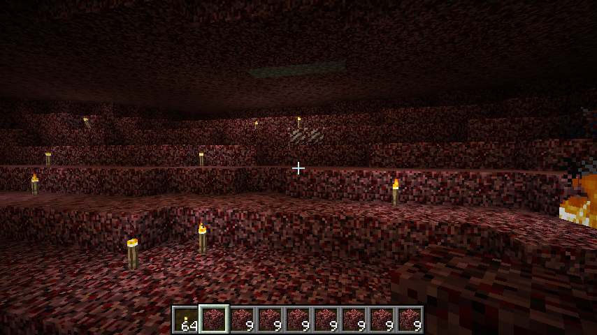
Diorite, granite, and netherrack received a smoother appearance by reducing sharp color transitions within the blocks.
-
Glowstone now looks symmetrical—the protruding part resembling a "glowing pimple" has been removed.
-
Cactus acquired a less bright green hue—the color became more subdued.
-
Glass features a transparent interior and a clear border along the edges.
-
Pumpkin lost its carved face both as a block and when worn as a headpiece.
-
TNT became label-free, making it more versatile.
-
Melon is now green (instead of yellow) with higher saturation than cactus.
-
Gravel, lava, dispenser, and cocoa beans reverted to textures from previous Minecraft versions that were removed by developers.
-
Smooth sandstone (regular and red) lost the stripe on the side and now resembles polished stone tile.
-
Purpur block transformed into a smooth tile instead of bricks with a "plus" pattern.
-
Podzol now has identical texture on top and side faces.
-
Hay bale features less vibrant red straps—they became a muted reddish-brown shade.
-
Birch logs became lighter due to lightening the dark spots, reducing overall contrast and improving compatibility with other blocks.